DAMIANA
Damiana was a project accomplished on the banks of a quiet river in an abandoned warehouse which was renovated into a restaurant with a bar and cafe. My mission was to achieve a modern, industrial aesthetic but with a warm, cosmopolitan feel, from developing the logo to comprehensive interior design. The owner had a tight budget and requested reuse of the furniture from her previous café. The project was challenging as it was to be completed during the COVID pandemic.
Concept Development + Graphic Design + Interior Development + Art Direction
Challenge:
Damiana was a challenging project from the beginning, especially as it was initiated during the middle of the COVID pandemic. The owner converted a rough warehouse space into a swanky restaurant with a café and bar, and I needed to design graphics that could express the essence of the space and appeal to customers, when fewer people were eating out.
Action:
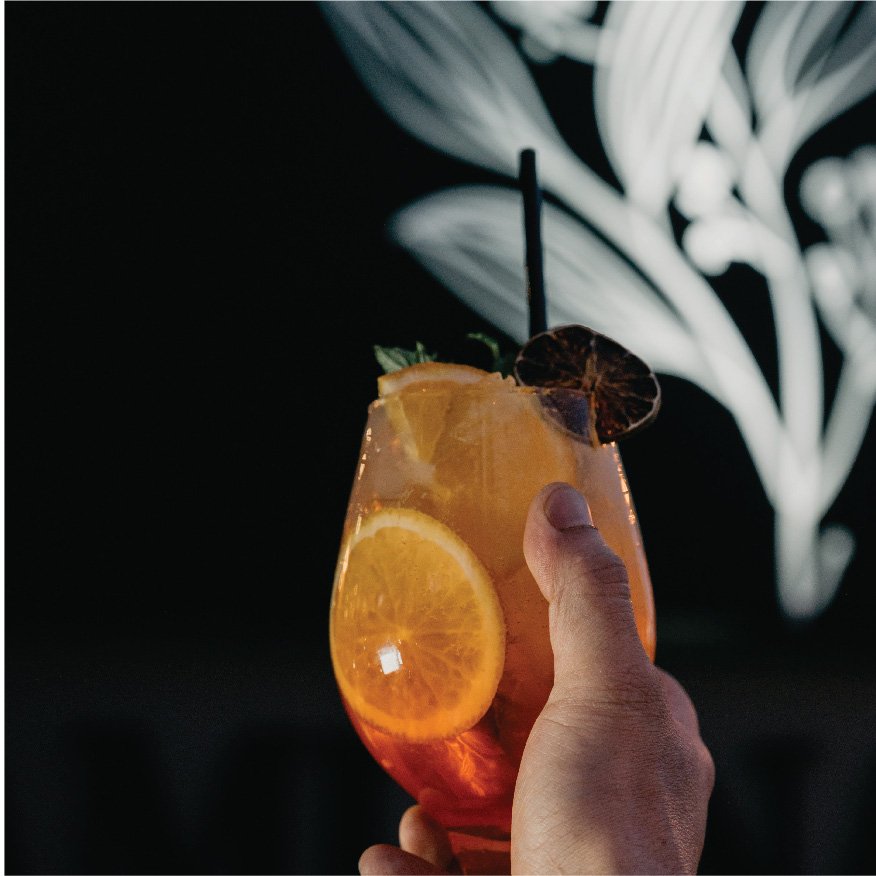
The overall graphic design was based on the idea of making the warehouse interior warm and inviting to customers, while maintaining the industrial feel. I needed to soften the edges of this stark space without losing the trendiness of the environment. The restaurant was by a calm river in a public park, so in many ways it was a marriage of opposites.
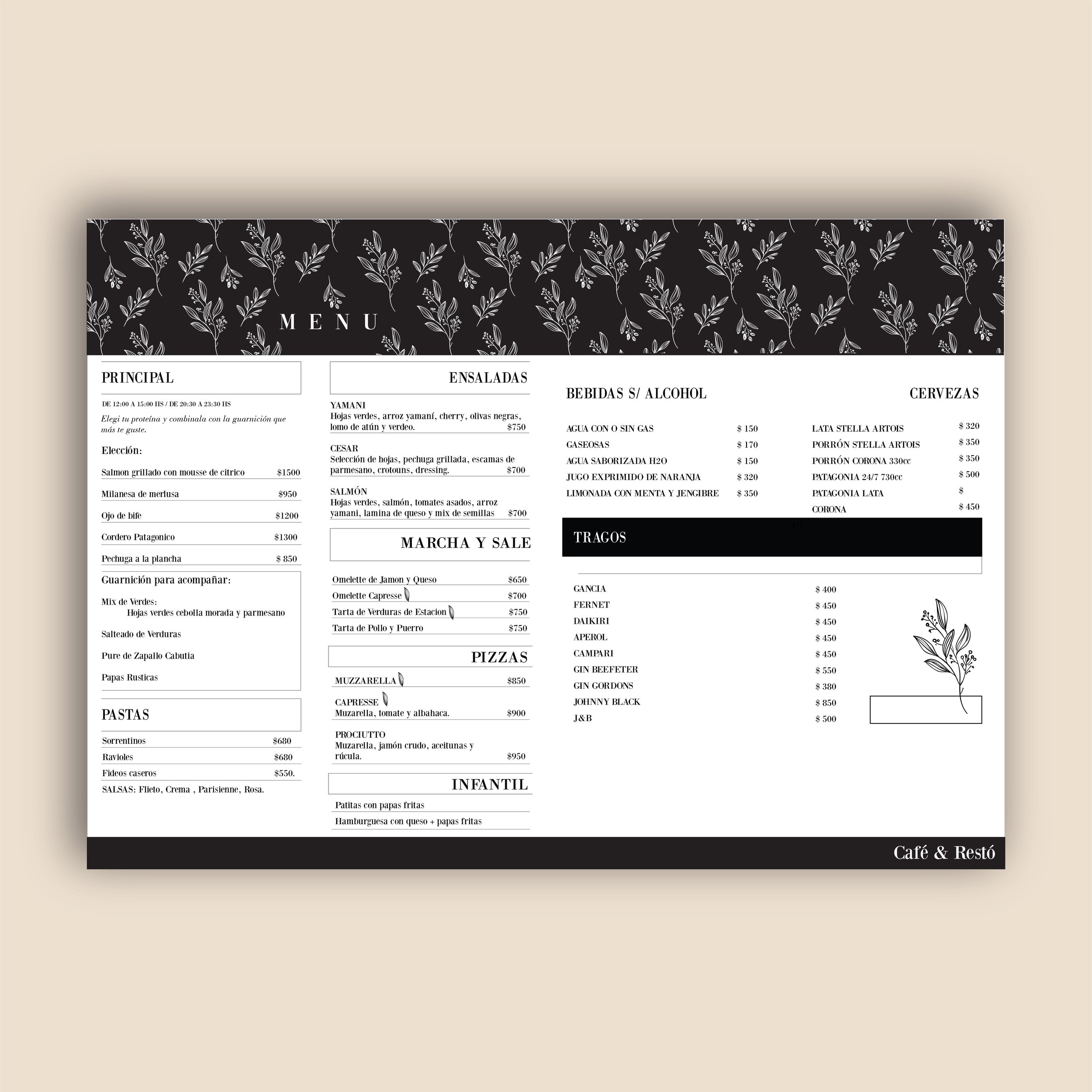
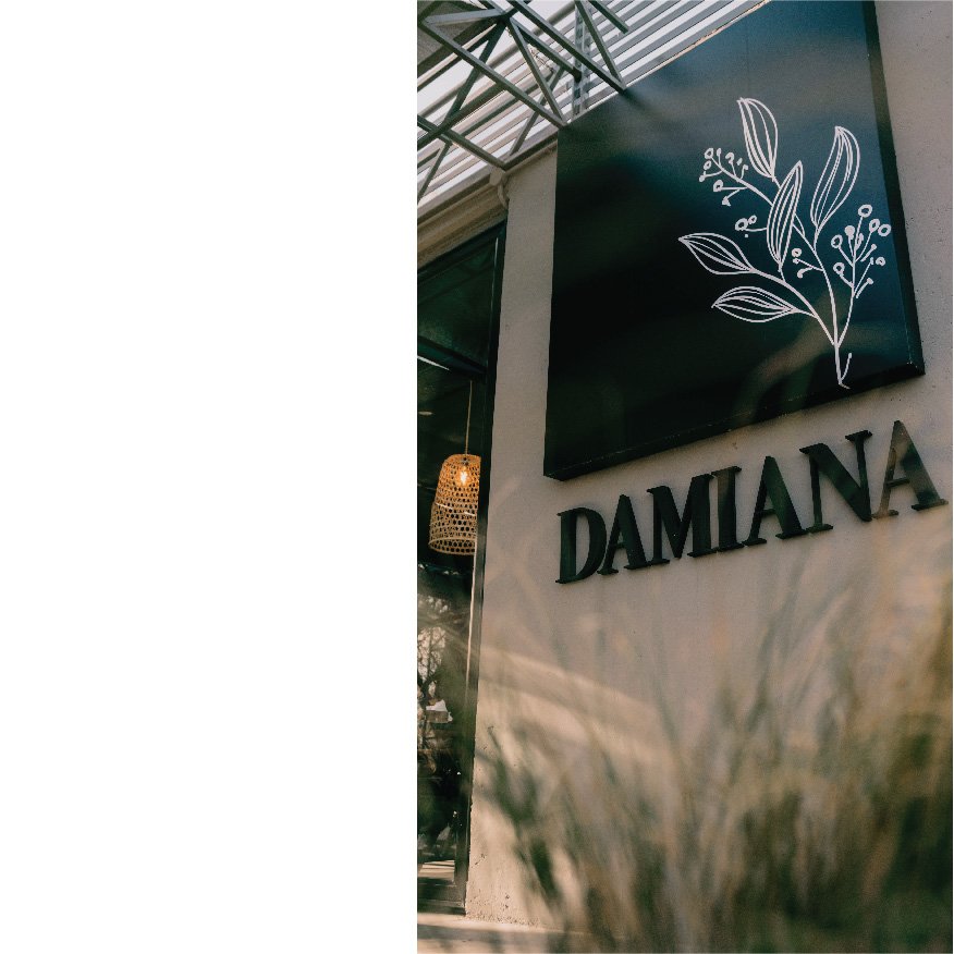
I began with creating the logo, which I would then use as the foundation for the graphics. The geometric structure overlayed with the branch of berries contrasted the industrial warehouse foundation with the natural beauty of the river and park adjacent to the restaurant. This simple logo inspired the colors, graphic themes and typography of the entire place.
“Damiana” is a Spanish masculine name, “Damian,” that the owner, a woman, made feminine by adding the “a.” Damian was a very popular in the 1950s, so this already gave the potential customers old-fashioned associations, so I wanted the graphics to reference vintage menus and black and white movies. By using matte black and white as the color for all the graphics and using all serif typeface, I united the themes of “the good days” with a clean and modern space, industrial and yet inviting. Black also suggested a bold and elegant femininity when combined with the name of the place.
Result:
The result was a design that integrated the graphics, typography and colors of the interior, exterior and furniture to express the soul of the restaurant with a small budget. Damiana’s owner was a female business owner who lost her previous business during the pandemic and used that setback to create something new. The aesthetic I created not only unites a rough, industrial space with a cozy atmosphere, but represents the spirit, regrowth, reinvention and personal power of the owner.